Stop Tourists, Ship Fixes: Cohort Retention for PMs & Analysts

Cohort retention analysis groups users by a shared starting point, usually a signup date or a first action, then tracks how many of them come back over time. Run one now: build a simple retention triangle for your last six signup cohorts, then check whether early rows are inflated by low-friction or AI-driven tourist signups before you trust a single number in it.
TL;DR:
- Cohort analysis reveals whether recent product changes, feature launches, or marketing channels genuinely improve retention by isolating variables across user groups over time.
- Using acquisition, behavioral, and revenue cohorts in layered analysis helps identify specific issues and actionable levers to improve long-term user retention.
- Reading retention tables down columns at fixed offsets uncovers trends, outlier cohorts, or abrupt cliffs that signal specific product or onboarding problems.
- Accurate data modeling requires clear definitions of cohorts, active events, and handling reactivations; small cohorts should be aggregated to avoid misleading volatility.
- Linking cohort insights directly to automated experiments and lifecycle flows accelerates retention improvements and prevents insights from being overlooked in dashboards.
Table of Contents
- What Cohort Retention Analysis Reveals That Blended Metrics Hide
- The Three Cohort Types and How to Pick the Right One
- How to Read a Cohort Table Without Missing the Signal
- Building a Reliable Retention Table: Data Model and SQL Pattern
- Why Cohort Charts Lie: Tourist Signups, Small Samples, and Blended Channels
- Turning Cohort Findings Into Experiments That Move Retention
- Choosing Between SQL, a Product Analytics Tool, or Both
- What Cohort Data Actually Requires to Become Retention Gains
- How Quicktoimpress Turns Retention Signals Into Shipped Fixes
- Sources
- FAQ
What Cohort Retention Analysis Reveals That Blended Metrics Hide
A blended retention rate tells you one number for your whole user base this month. It cannot tell you whether last month’s product change helped, hurt, or did nothing, because it mixes users who joined three years ago with users who joined three days ago into a single average. Cohort retention analysis fixes that by grouping users who share a starting point, most often a signup date, and tracking what percentage of each group returns in the weeks or months after. The technique turns a single blended churn rate into a longitudinal view, and that shift from snapshot to timeline is the entire point of the method, according to Mixpanel’s cohort analysis guide.
Blended metrics answer “how are we doing.” Cohort analysis answers “why,” and it does so by isolating variables you’d otherwise never separate. Did the January signups retain better than December’s because of the new onboarding flow, or because a paid campaign brought in higher intent users? A blended number can’t say. A cohort table splits December and January into their own rows, and the difference becomes visible immediately.
Three situations make cohort analysis close to mandatory rather than optional:
- Onboarding changes: You shipped a new welcome flow and need to know if week 1 retention moved for cohorts who joined after launch versus before.
- Feature launches: A new feature rolled out mid-quarter, and you need to isolate whether cohorts exposed to it from day one behave differently than legacy cohorts who adopted it late.
- Channel shifts: Marketing pivoted spend toward a new acquisition channel, and you need to confirm those users retain as well as the old channel before scaling the budget.
The business case is not abstract. Retention compounds in a way acquisition never does, because a small improvement in the retention curve raises the lifetime value of every future cohort, not just the current one. That’s why growth teams that treat cohort tables as a weekly habit, not a quarterly report, tend to catch problems while they’re still cheap to fix. A leak discovered in week 2 of a cohort’s life is a product tweak. The same leak discovered six months later, after three more cohorts inherited it, is a much bigger cleanup job.
The Three Cohort Types and How to Pick the Right One
Most teams default to one cohort type and wonder why the data never quite answers their question. The fix is matching the cohort type to what you’re actually trying to learn, and layering types when one question requires two lenses.
- Acquisition (time-based) cohorts. These group users by when they joined, typically by day, week, or month. Weekly cadence works well for high-volume consumer apps where you need enough users per cohort to smooth out noise; monthly cadence suits B2B SaaS products with lower signup volume and longer sales cycles. Use acquisition cohorts as your trend detector: they tell you whether retention is getting better or worse over calendar time, which is the first thing any stakeholder will ask.
- Behavioral cohorts. These group users by an action, or the deliberate absence of one, within a defined window, such as “completed setup within 7 days” versus “did not.” Behavioral cohorts are the most actionable of the three because they point directly at a lever you can pull. Mixpanel’s research frames this well: behavioral grouping lets teams identify activation milestones and then design onboarding specifically to push more new users toward hitting them. For product-led businesses, the moment a user reaches genuine “time to value,” their first meaningful win inside the product, is often the single most predictive behavior for long-term retention, which makes it the natural target for a behavioral cohort.
- Revenue cohorts. These track dollars retained rather than users retained, and they matter most for subscription and usage-based businesses where net dollar retention, not logo count, drives the board conversation. A revenue cohort can show 92% logo retention alongside 105% net dollar retention, meaning the customers who stayed expanded enough to offset the ones who churned. That distinction changes what “healthy retention” even means for a revenue operations team tracking net dollar retention as a primary health metric.
The strongest workflow doesn’t pick one type and stop. It layers them: use acquisition cohorts to spot that something changed (retention dipped starting with the March cohort), then build a behavioral cohort to explain why (users who joined in March were less likely to complete the new setup wizard in their first week). Amplitude’s guidance on this is direct, use acquisition cohorts to catch the trend and behavioral cohorts to explain the cause, and that two-step sequence is what separates teams that just watch retention from teams that actually move it.
How to Read a Cohort Table Without Missing the Signal
A cohort retention table is a grid: rows are cohorts (grouped by join date), columns are time offsets (week 1, week 2, month 3, and so on), and each cell is the percentage of that cohort still active at that offset. Reading it wrong is easy, because the instinct is to scan left to right across a row. The more useful read is down a fixed column, comparing the same offset across multiple cohorts, because that’s how you see whether a specific week of life is improving or degrading over calendar time.
Three shapes show up over and over, and each one implies a different fix.
- Perpetual decline. Retention keeps dropping every period with no floor in sight. This usually means the product hasn’t found a durable reason for people to stick around, and no onboarding tweak will fix it, because the problem is deeper than activation.
- Flatten and hold. Retention drops sharply in the early weeks, then levels off at some percentage and holds roughly flat for months. This is the healthiest shape for most products: it means you have a core group who found lasting value, and your job shifts to growing that flat percentage, not stopping the initial drop entirely (some early drop is normal and often unavoidable).
- Smile curve. Retention dips, then curves back upward in later periods. This looks alarming until you realize it usually signals seasonal or habitual usage, tax software, some B2B reporting tools, or products with cyclical use cases where users vanish between cycles and come back exactly when needed.
Statistic to watch for: Rebasing your measurement window can change your entire read of a cohort. Instead of anchoring on month 0, compare month 12 retention against month 3 retention for the same cohort. That rebase to month 3 approach strips out the early tourist churn that inflates the denominator and lets the real, foundational cohort show through.
Once you know the shape, the diagnostic sequence is short: check for cliffs first, a single-period drop far steeper than the surrounding periods usually points to a specific event (a pricing change, an outage, a broken email flow) rather than a gradual trend. Check for outlier cohorts next, one cohort behaving wildly differently from its neighbors, often traces back to a single acquisition channel or promotion that got blended in. Finally, scan cohort-over-cohort trend at a fixed offset. If week-4 retention has been quietly sliding for the last five cohorts, that’s the number to bring to your next roadmap meeting, not the noisy week-1 number everyone stares at instead.
Building a Reliable Retention Table: Data Model and SQL Pattern
The math behind cohort retention is simple. The mechanics of getting clean data into that math are where most tables go wrong.
The core formula:
$$\text{Retention Rate} = \frac{\text{Users active in period N}}{\text{Users in the original cohort}} \times 100$$
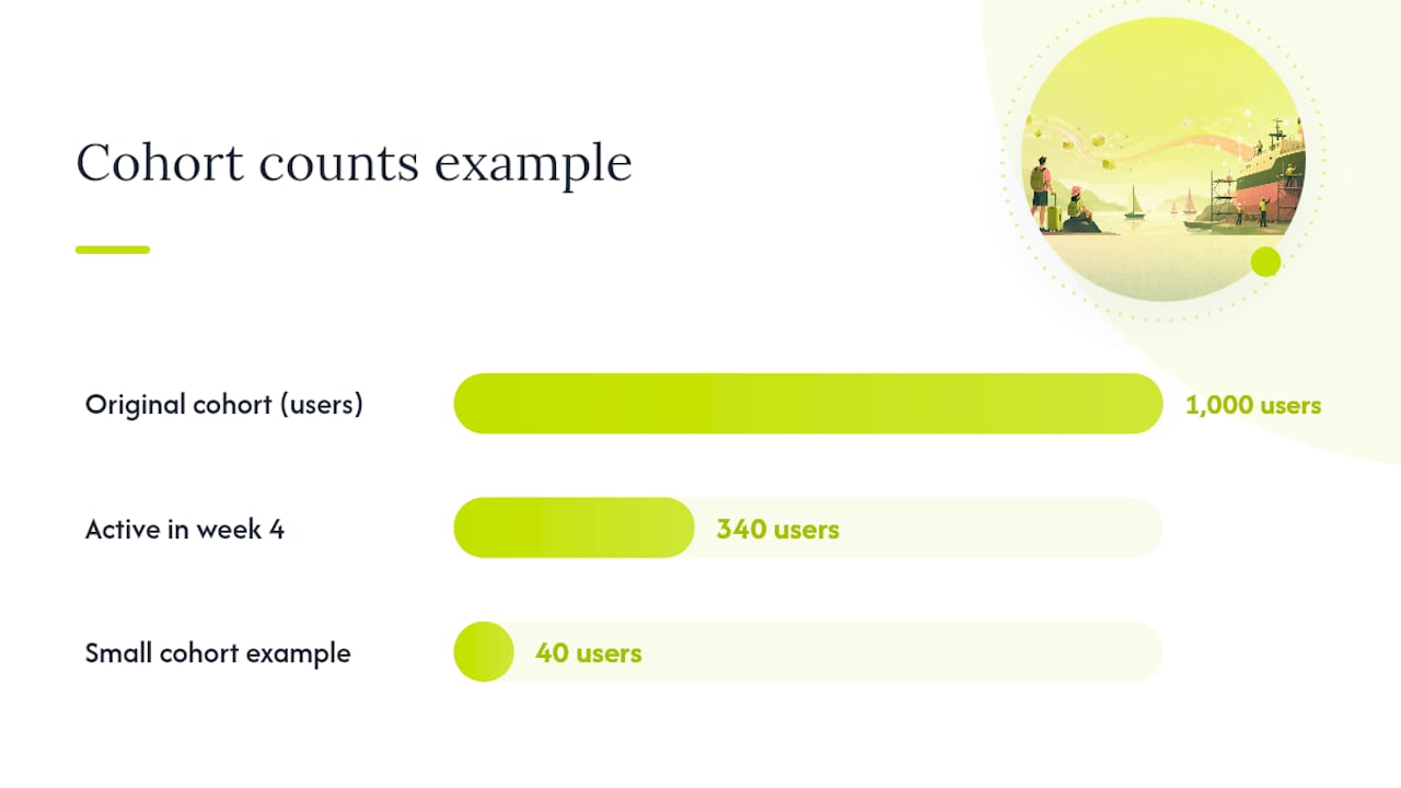
If 1,000 users signed up in January and 340 of them logged in during their fourth week, week-4 retention for that cohort is 34%. Simple in isolation. The complexity shows up in how you define “cohort,” “active,” and “period,” and getting those three definitions wrong is what produces a chart that looks fine and is quietly lying to you.
- Define the cohort key. Use
date_truncon the user’s first qualifying event, usually signup or account creation, truncated to the granularity you need (day, week, or month). Weekly granularity suits high-volume products; monthly suits lower-volume B2B tools where daily cohorts would be too small to read. - Define the retention event precisely. “Active” needs a strict definition: a login, a core action, a session over some duration. Vague definitions produce vanity metrics. Decide this before you write a single line of SQL, not after you see a chart you don’t like.
- Write the assignment and offset pattern. The standard SQL pattern joins a cohort table (first event per user) against an activity table (all events), calculates the period offset as the date difference between the activity and the cohort date, then aggregates count of distinct users per cohort per offset. Normalize each cell by dividing by the original cohort size to get a percentage rather than a raw count.
- Handle re-activations explicitly. A common technical mistake is counting a user as “active” in every period they show up, without distinguishing continuous presence from a re-activation after a gap. That distinction breaks the assumptions behind a standard survival curve if you don’t handle it deliberately, according to the SQL implementation walkthrough on dev.to. Decide upfront whether “retained” means continuously present since joining, or simply active at some point in period N, and build flags for first-drop and reactivation windows so both readings are available.
- Reconcile before you trust the table. Sum every cell in your cohort table and compare that total against the raw event count for the same date range. A mismatch means your join logic is duplicating or dropping rows somewhere, and it’s far easier to catch that with a five-minute reconciliation query than to catch it after a stakeholder asks why retention jumped 8 points overnight.
Pro Tip: Set a minimum cohort size threshold, often around 200 to 300 users, below which you stop trusting the percentage and start reporting raw counts instead. A cohort of 40 users where 3 churn looks like a 7.5-point retention drop on a chart, but it’s really just three people, and treating it as a trend is how teams chase ghosts.
Lookback windows matter too. A table that only shows 8 weeks of history hides the smile curve that only appears at month 4. Build your pipeline to retain at least 12 months of raw event history even if your dashboard only displays 90 days by default, because you will eventually need to answer a question your current window can’t cover.
Why Cohort Charts Lie: Tourist Signups, Small Samples, and Blended Channels
A technically correct cohort table can still mislead you, and the traps are almost always about who got counted, not the math.
Tourist and AI-driven signup noise is the newest version of an old problem. Free trials, promotional giveaways, and low-friction signup flows pull in people who never intended to become real users, and increasingly, automated or AI-driven signups add another layer of noise that has nothing to do with product quality. These signups tank your month-0 and month-1 numbers and make every cohort look worse than the durable user base actually is.
Statistic to watch for: The fix that practitioners increasingly rely on is rebasing the comparison window itself. Rather than measuring from month 0, compare month 12 retention against month 3 retention for the same cohort, which filters out most of the tourist churn and reveals the retention curve of people who actually stuck around long enough to matter.
The other traps show up just as often and get far less attention:
- “Active” versus “retained” ambiguity. Decide intentionally whether you’re counting anyone who logged in during a period, or only users who’ve been continuously present since joining. Mixing the two definitions across different reports is how two teams end up arguing over numbers that were never measuring the same thing.
- Small-cohort volatility. A cohort under a couple hundred users will swing wildly on small absolute changes. Aggregate weekly cohorts into monthly buckets, or combine adjacent small cohorts, before drawing any conclusion from them.
- Channel blending. A cohort table that mixes organic signups, paid acquisition, and referral traffic into one row hides the fact that one channel might be dragging the average down. Filter cohort views by acquisition channel whenever you have the volume to support it, especially before recommending a budget shift based on a blended number.
- Cohort contamination from reactivated dormant users. If your definition of “new user” doesn’t exclude someone returning after a year away, you’ll double count them as both a churned member of an old cohort and a fresh signup in a new one, quietly inflating both cohorts’ apparent health.
Turning Cohort Findings Into Experiments That Move Retention
A cohort table on its own is a diagnosis, not a treatment. The teams that actually move retention numbers follow a consistent workflow: spot the signal, isolate the behavior behind it, then test a change designed to push more users toward that behavior.
- Pick your leverage point first. Look for two things in your table: a sharp cliff at a specific offset (a fixable, specific failure) or a large, stable cohort with unusually strong retention (a pattern worth replicating). Both are worth more of your time than a slow, gradual decline with no clear inflection point.
- Write a hypothesis tied to a specific behavior and a specific number. Something like: “Users who complete the integration step within 48 hours retain at 61% by week 4, versus 38% for those who don’t; if we get 20% more users through that step in their first 48 hours, week-4 retention should rise by roughly 4 to 5 points.” A vague hypothesis produces a vague experiment.
- Design the experiment with cohort-aware controls. Randomize at the cohort level where possible, hold your measurement window fixed and long enough to see the retention effect play out (not just a week-1 activation bump that fades), and set a guardrail metric, usually a core engagement or revenue number, so you catch it if the change moves retention up while quietly hurting something else.
- Ship the winning behavior into the lifecycle, not just the test group. If completing setup in 48 hours predicts retention, build an automated nudge, an in-app prompt, a triggered email, or a reactivation flow for anyone who stalls past that window, that pushes every future cohort toward the behavior you already proved matters.
The workflow that consistently works, according to Amplitude’s guidance on cohort-driven analysis, pairs the cohort table with deliberate experimentation to prove causation rather than just correlation. Finding that a cohort retained well is a clue. Proving that a specific onboarding change caused it is the only thing that justifies rolling the change out everywhere.
Pro Tip: When you find an outperforming cohort, resist the urge to just chart it and move on. Growth teams that stop at visualization leave the highest-return work undone, which is digging into what that specific cohort did differently and then deliberately engineering more users toward that same path.

Choosing Between SQL, a Product Analytics Tool, or Both
The right tool depends on how flexible your questions need to be, not on which platform has the prettiest chart.
A warehouse and SQL setup gives you full control: multi-criteria cohorts (users who did X and did not do Y within a specific window), custom identity resolution across devices and logged-out sessions, and lookback windows limited only by how much raw data you retain. The tradeoff is speed. Every new question means a new query, and that’s a real cost when a product manager needs an answer inside a standup, not by end of week.
A dedicated product analytics tool trades some of that flexibility for speed. Most modern platforms handle basic acquisition and behavioral cohorts out of the box, with drag-and-drop filters that don’t require an analyst to build. The tradeoff shows up in the fine print: many platforms sample data past a certain volume threshold, apply a rolling retention-history cap that quietly drops your oldest cohorts from view, or handle “did not do” logic clumsily compared to a well-written SQL query. Read the platform’s documentation on sampling and history limits before you build a dashboard your team will rely on for a board deck.
The capabilities that matter most regardless of which route you take:
- Support for multi-criteria and negative-condition cohorts (“did X, did not do Y”)
- Reliable identity resolution across devices, sessions, and logged-out states
- Long lookback windows that don’t silently truncate older cohorts
- Export or API access so a warehouse team can validate what the dashboard shows
Most mature teams end up running both: a fast analytics tool for the day-to-day questions PMs ask, and a warehouse pipeline for the questions that need custom logic or need to survive an audit. Automating that pipeline so both stay in sync, rather than drifting into two different “truths,” is its own growth platform problem, and it’s one that quietly eats more analyst time than the cohort math itself.
What Cohort Data Actually Requires to Become Retention Gains
Most teams that struggle with cohort analysis aren’t struggling with the math. They’re struggling with the gap between building the table and doing something with it, and that gap is almost always an engineering and operations problem disguised as an analytics problem.
Embedding strategy with execution means the person who spots the cliff in week 2 of a cohort’s life is also positioned to ship the fix, wire up the SQL reconciliation checks, and build the automated nudge that pushes the next cohort past that same cliff, without three handoffs and a six-week backlog in between. For B2B SaaS teams especially, the distance between “we found the activation milestone that predicts retention” and “every new signup now gets nudged toward that milestone automatically” is where most retention gains actually get lost. A cohort table that sits in a dashboard nobody acts on is worth less than a rougher table that feeds directly into a working automation.
That’s the practical argument for treating retention analytics and the systems that act on it as one connected problem, not two separate projects run by two separate teams on two separate timelines.
— Service
How Quicktoimpress Turns Retention Signals Into Shipped Fixes
We partner to close the gap between a cohort chart and a shipped fix, without the multi-team handoff that usually stalls it. We build the analytics pipelines, the automated activation nudges, and the revenue operations systems that turn a diagnosed retention cliff into a running experiment inside weeks, not quarters.

That means reliable dashboards your team actually trusts, faster experiment velocity because the people who found the signal also build the fix, and automated lifecycle flows, onboarding nudges, reactivation triggers, that act on your cohort data instead of just displaying it. Whether you’re centralizing retention reporting across multi-location brands or wiring net dollar retention into your revenue operations stack, the work is the same: senior strategy paired with hands-on delivery. Start with a consultation with Quicktoimpress to review your current cohort setup and find the highest-leverage fix worth shipping first.
Sources
Mixpanel’s cohort analysis guide covers chart-reading and platform selection in depth. Userpilot’s piece on separating tourists from real users details the rebasing technique. The dev.to SQL walkthrough and Amplitude’s cohort guide round out implementation and experimentation practice.
- Cohort analysis in 2026: How to read the chart, choose a platform, and turn retention into growth | Mixpanel
- Cohort Retention Analysis in 2026: How to Separate Real Users From AI Tourists | Userpilot
- The Complete Guide to Cohort Analysis | Amplitude
FAQ
What is an example of a cohort analysis?
A SaaS company groups everyone who signed up in March into one cohort, then tracks what percentage log in during week 1, week 4, and month 3, comparing that curve against the February and April cohorts to see if a mid-March onboarding change helped.
What is the cohort analysis method?
The method groups users by a shared starting point, acquisition date, a specific behavior, or revenue tier, then tracks a defined activity across fixed time offsets to reveal retention patterns a blended average would hide.
How do you calculate cohort retention?
Divide the number of users from a cohort active in period N by the total original size of that cohort, then multiply by 100; a cohort of 1,000 signups with 340 active in week 4 has 34% week-4 retention.
What does a cohort analysis tell you?
It tells you when a specific group of users starts dropping off, whether that drop is getting better or worse across newer cohorts, and, when paired with behavioral cohorts, which early actions predict who sticks around.