8–12 KPIs for Role Specific Marketing Dashboards with Trusted Data

Every marketing dashboard should lead with a tight set of headline metrics: sessions or reach, click-through rate, conversion rate, customer acquisition cost (CAC), lifetime value (LTV), churn, and return on ad spend (ROAS). That mix pairs leading indicators like CTR and engagement with lagging ones like revenue and CAC, so a team can see what’s happening now and confirm what already happened. What follows breaks these down by marketing function, shows how to choose and prioritize them, and covers the layout and integration work that makes the numbers trustworthy.
TL;DR:
- Focusing on specific KPIs aligned with each funnel stage helps pinpoint where issues originate, whether upstream or downstream, for targeted improvements.
- Using paired leading and lagging indicators provides real-time insight into performance and confirms long-term results, enabling quicker, informed decisions.
- Limiting dashboards to 8–12 role-specific metrics prevents analysis paralysis and ensures teams focus on actions that will drive change.
- Clear data sources, standardized definitions, and regular refreshes are essential to maintain trust and accuracy in marketing dashboards.
- Ownership and role-based views are crucial; without accountability for data integrity and relevance, dashboards risk becoming irrelevant or unreliable.
Table of Contents
- Which Marketing Dashboard Metrics Matter at Each Funnel Stage?
- Leading vs. Lagging Indicators: What Helps You Act vs. What Confirms Results
- How Do You Choose and Prioritize the Right KPIs?
- How Should You Lay Out and Visualize Dashboard Metrics?
- What Data Sources and Integrations Does a Reliable Dashboard Need?
- Why Do Marketing Dashboards Fail, and How Do You Fix Them?
- What Do Role-Specific Marketing Dashboards Look Like?
- What Growth Engineering Teams Get Right About Dashboard Delivery
- Build a Marketing Dashboard That Actually Gets Used
- Sources
Which Marketing Dashboard Metrics Matter at Each Funnel Stage?
A dashboard organized by funnel stage does something a flat metric list never does: it shows you where the problem actually lives. If conversion rate is fine but revenue is flat, the issue is upstream, in awareness or consideration, not in your checkout flow. SEMrush’s KPI framework and Klipfolio’s core digital KPI list both organize metrics this way for a reason: it maps straight to where a marketer needs to intervene.
Awareness metrics measure whether anyone is finding you at all:
- Reach and impressions, segmented by channel, to spot which platform is actually growing your top of funnel.
- Organic sessions and branded search volume, compared against the prior month to catch early SEO decay.
- Share of voice against named competitors in paid search or social, when that data is available.
Consideration metrics show whether interest is converting into engagement:
- Click-through rate (CTR), broken out by campaign and creative, not just averaged across an account.
- Bounce rate and average session duration by landing page, since a high bounce on a paid landing page often means a message mismatch, not a traffic problem.
- Email open rate and content engagement rate, segmented by list segment or lifecycle stage.
Conversion metrics are where budget accountability lives:
- Conversion rate by channel and by campaign, benchmarked against the trailing 90-day average rather than just last month.
- Cost per lead (CPL) and cost per acquisition (CPA), segmented by campaign and audience so you know which spend is actually earning its keep.
- Form completion rate and cart abandonment rate for commerce or lead-gen sites.
Revenue metrics connect marketing activity to money:
- ROAS by channel, with a target range set per channel type since paid social and paid search rarely perform at the same efficiency.
- CAC, tracked against LTV to keep the ratio (ideally 3:1 or better) visible to leadership, not buried in a spreadsheet.
- Marketing-attributed revenue and pipeline contribution, cohorted by acquisition month.
Retention metrics get less attention than they deserve on most dashboards:
- Churn rate, segmented by cohort and acquisition channel, since customers acquired through a discount promo often churn faster than organic sign-ups.
- Repeat purchase rate or renewal rate, tracked monthly against a rolling 12-month baseline.
- Net revenue retention for subscription and SaaS metrics dashboard setups, since this single number often predicts growth better than new customer counts.
Segment every one of these by channel, campaign, and cohort wherever the data allows it. A single blended conversion rate hides more than it reveals; a channel-level breakdown tells you exactly where to shift budget next week.
Leading vs. Lagging Indicators: What Helps You Act vs. What Confirms Results
Leading indicators move first and tell you where things are headed. Lagging indicators arrive after the fact and tell you what already happened. CTR, engagement rate, and email open rate are leading; revenue, churn, and CAC are lagging. A dashboard built only on lagging metrics tells you the fire already burned the building down.

The useful pattern is pairing them. CTR (leading) paired with conversion rate (lagging) tells you whether a creative problem or a landing page problem is dragging down campaign performance. Email open rate (leading) paired with revenue per email (lagging) tells you whether subject line testing is actually worth the effort or just generating vanity opens.
Cognitive research on dashboard design backs up why this pairing matters more than adding more metrics: the human brain processes information most effectively in chunks of roughly five to nine items at a time, which is exactly why cramming twenty metrics onto one screen doesn’t produce better decisions, just slower ones.
Pro Tip: Set alert thresholds on leading indicators, not lagging ones. Wait for the revenue dip to show up and you’ve already burned a week of budget.
Use leading metrics for real-time marketing dashboards and short-cycle alerting. Reserve lagging metrics for weekly or monthly review, where the goal is verification, not urgency.
How Do You Choose and Prioritize the Right KPIs?
Most dashboards fail not because the metrics are wrong but because there are too many of them, chosen by committee instead of by goal. Here’s a workable sequence:
- Start from the business goal, not the available data. If the goal is pipeline growth, your headline metrics are CAC, marketing-attributed pipeline, and conversion rate. If the goal is brand awareness for a new market, reach and share of voice belong at the top instead.
- Map each goal to its funnel stage. A goal tied to consideration doesn’t need a revenue metric front and center. Keep the connection between what you’re measuring and what you’re trying to move.
- Build tiered views by role. An executive marketing dashboard should show 5 to 8 metrics tied to ROI, revenue, and CAC. Manager views can carry 8 to 12, adding channel and campaign detail. Specialist views can go deeper still, since that’s where the day-to-day optimization happens. Monday makes the same case: tiering by role keeps each audience looking at what’s actually relevant to their decisions, instead of scrolling past noise.
- Cap the count. Somewhere between 8 and 12 KPIs per view is the practical ceiling. Past that, dashboards start producing worse decisions, not better ones, and teams quietly go back to spreadsheets.
- Set targets before you set the dashboard live. A number with no target is just trivia. Pull a 90-day baseline for each metric, then set a realistic target range around it.
- Validate the metric definitions across teams. If sales counts a “lead” differently than marketing does, your CPL numbers will never reconcile, and every review meeting turns into a definitions argument instead of a strategy conversation.
Pro Tip: Before launch, run every proposed metric through one test: “If this number moved 20% tomorrow, would anyone change what they’re doing?” If the answer is no, cut it.
How Should You Lay Out and Visualize Dashboard Metrics?
Dashboards rely on four working parts: data sources, the metrics themselves, visualizations, and filters that let a viewer segment on demand. Get the layout wrong and even good metrics get ignored. Get it right, and a funnel-style pipeline from raw data to visualization makes the whole thing feel obvious at a glance.
Put your highest-priority scorecards top-left, since that’s where the eye lands first on any screen, desktop or mobile. Trend charts and breakdowns belong below or to the right, supporting the headline number rather than competing with it for attention.
Match the chart type to the question you’re answering:
- Line charts for trends over time, like sessions or CAC across a quarter.
- Bar charts for comparing discrete categories, like ROAS by channel.
- Cohort heatmaps for retention analysis, since a cohort table shows churn patterns a simple line chart hides entirely.
- Bubble charts for comparing three variables at once, like spend, conversion rate, and ROAS by campaign.
- Tables for granular, exportable detail that specialists need but executives don’t.
Filters for date range, channel, and campaign should sit consistently in the same spot across every view, not reinvented per page. Add thresholds and annotations wherever a metric crosses a meaningful line. A dashboard becomes genuinely actionable when a red threshold or a drilldown link lets someone move from “that number looks off” to “here’s the campaign causing it” in two clicks, not twenty.
What Data Sources and Integrations Does a Reliable Dashboard Need?
Every metric on your dashboard traces back to a source system, and mismatched or stale sources are where most dashboard trust problems start.
- Google Analytics 4 feeds sessions, engagement rate, and conversion events.
- Ad platforms (Google Ads, Meta, LinkedIn) feed spend, CTR, and CPL by campaign.
- Your CRM (HubSpot, Salesforce, or similar) feeds pipeline, CAC, and lead-to-customer conversion.
- E-commerce platforms feed revenue, cart abandonment, and average order value.
- Email platforms feed open rate, CTR, and revenue per send.
Pulling all of this into one place typically means an API layer feeding a data warehouse, with a transformation step that standardizes definitions before anything hits a chart. A practical build pattern here mirrors what open-source analytics dashboards already demonstrate: dedicated endpoints for revenue, traffic, and stats, cached and refreshed on a set schedule instead of queried live every time someone loads a page. Quicktoimpress builds this kind of growth platform integration work for clients managing exactly this kind of fragmented stack.
| Data need | Why it matters |
|---|---|
| Canonical metric definitions | Prevents sales and marketing from reporting different “lead” counts |
| Refresh cadence per source | Ad platform data can lag a day or two; real-time dashboards need to account for that |
| Data freshness monitoring | Flags a broken connector before a stakeholder notices a metric frozen at zero |
| Warehouse as single source of truth | Stops each tool from calculating the same metric a different way |
Set a refresh SLA per data source and monitor it. A dashboard that quietly stopped updating three days ago is worse than no dashboard at all, because everyone keeps trusting numbers that are already wrong.
Why Do Marketing Dashboards Fail, and How Do You Fix Them?
Dashboards fail in a small number of predictable ways, and each one has a specific fix.
- Metric overload. Too many KPIs on one view causes analysis paralysis, and it’s a documented pattern: users routinely give up on cluttered dashboards and export to spreadsheets instead. Fix it by pruning back to 8 to 12 KPIs per view and moving the rest to a drilldown.
- Stale data. A dashboard showing yesterday’s numbers as if they’re current erodes trust fast. Fix it by setting refresh alerts tied to each data source’s SLA.
- Inconsistent definitions. If finance and marketing calculate “revenue” differently, every leadership review turns into a reconciliation exercise. Fix it by documenting one canonical definition per metric and assigning an owner accountable for it.
- Vanity metrics dominating the view. Impressions and followers feel good but rarely drive a decision. Fix it by asking, for every metric on the screen, what action it’s supposed to trigger.
- No ownership. A dashboard nobody owns slowly drifts out of date. Fix it by naming one person responsible for each metric’s accuracy, not just the dashboard as a whole.
Pro Tip: Run a quarterly dashboard health check: pull up every view and ask “would we notice if this metric broke?” If the answer is no, that metric probably shouldn’t be there.
What Do Role-Specific Marketing Dashboards Look Like?
A CMO doesn’t need the same screen as a paid media manager, and building one dashboard to serve everyone is exactly how metric overload happens. Templates built around role cut build time and keep each view focused on the decisions that role actually makes.
- Executive marketing dashboard (CMO): revenue contribution, blended CAC, LTV to CAC ratio, marketing-sourced pipeline, and overall ROAS. Five to eight metrics, no campaign-level detail.
- Paid media: spend, CTR, conversion rate, cost per lead, and ROAS, all broken out by campaign and platform.
- SEO: organic sessions, keyword ranking trends, organic CTR, and referring domains or backlinks.
- Email: open rate, CTR, conversion rate per send, and revenue per email, segmented by list and lifecycle stage.
- Lead generation: form completion rate, cost per lead, lead-to-opportunity conversion, and pipeline value by source.
| Role | Primary metrics | Typical count |
|---|---|---|
| CMO / executive | Revenue contribution, CAC, LTV:CAC, pipeline, ROAS | 5 to 8 |
| Paid media manager | Spend, CTR, CVR, CPL, ROAS by campaign | 8 to 12 |
| SEO specialist | Organic sessions, keyword trends, CTR, backlinks | 8 to 12 |
| Email marketer | Open rate, CTR, conversion per send, revenue per email | 6 to 10 |
Anyone building campaigns tied to organic growth should also look at how campaign planning connects to sustained organic performance, since the metrics you track upstream shape which campaigns actually get funded.
What Growth Engineering Teams Get Right About Dashboard Delivery
The gap between a dashboard that looks good in a demo and one that survives six months of real use almost always comes down to ownership, not design polish. A tiered structure across executive, manager, and specialist views only holds up if someone is accountable for keeping the underlying data pipeline honest, and most in-house teams build the dashboard first and figure out data governance later, which is backward.
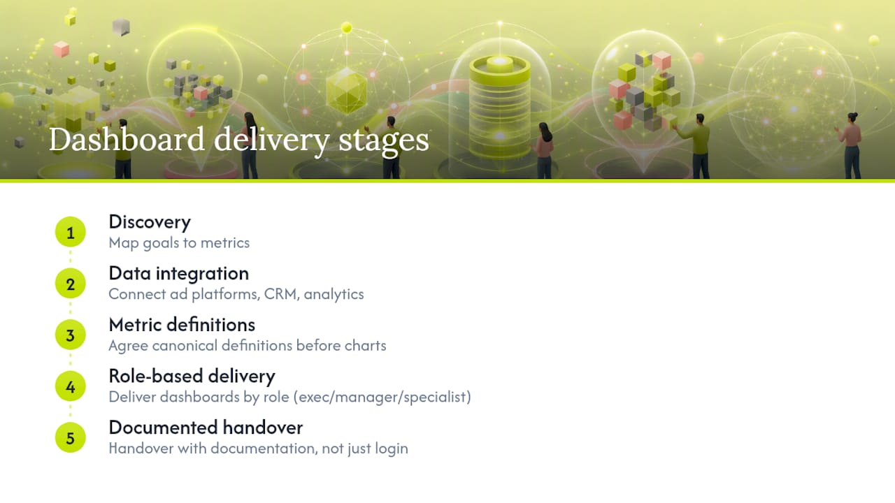
A repeatable engagement typically runs through five stages: discovery to map goals to metrics, data integration across ad platforms, CRM, and analytics, canonical metric definitions agreed on before a single chart gets built, dashboard delivery organized by role, and a handover that includes documentation, not just a login.
— Service
Build a Marketing Dashboard That Actually Gets Used
Most teams don’t have a metrics problem. They have an integration problem. Every marketing platform in the stack (Google Analytics, ad accounts, HubSpot or Salesforce, email tools) reports numbers that never quite line up, and the dashboard becomes a place to argue about definitions instead of a place to make decisions.
We build the connected data layer underneath the dashboard, not just the charts on top. That means canonical metric definitions across your CRM and ad platforms, a data warehouse that stops each tool from calculating “conversion” its own way, and revenue operations architecture that ties marketing activity directly to pipeline and revenue. For multi-location brands and B2B SaaS teams running fragmented stacks across HubSpot, Salesforce, and half a dozen ad platforms, that integration work is usually the actual bottleneck, not the visualization layer.
If your team is rebuilding dashboards every quarter because the numbers never match, see how Quicktoimpress works and get a straight read on what a real data integration project would involve for your stack.